Best Quinceanera Color Combinations to Love
October 7, 2026 · 6 min read
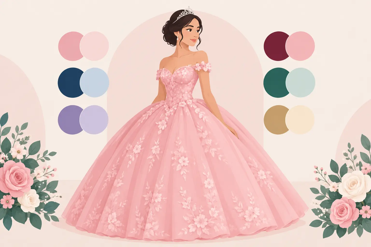
A quinceañera palette does more than choose the color of a dress. It sets the feeling guests carry from the first invitation to the last dance. The best quinceanera color combinations feel true to the guest of honor, look beautiful in photos, and create a celebration where every detail belongs together - from florals and linens to the cake, candles, and court attire.
The right choice is not always the trendiest one. A color that looks incredible online may feel too bright in a sunlit room, too dark for a spring celebration, or difficult to coordinate across dresses, décor, and family attire. Start with the mood you want to create, then build a palette that gives your celebration warmth, personality, and room to shine.
Start With the Feeling, Not Just a Favorite Color
A favorite color is a wonderful place to begin, but a complete palette needs contrast and balance. Think about how the celebration should feel. Is it romantic and traditional, bold and glamorous, soft and garden-inspired, or modern and fashion-forward? That answer will help you choose supporting tones that make the main color look intentional rather than overwhelming.
Most polished quinceañera palettes include a primary color, one or two supporting shades, and a neutral or metallic accent. For example, blush can be the star while ivory keeps the design light and gold adds a formal glow. Royal blue can feel especially dramatic with silver and crisp white, while emerald green gains warmth beside champagne and soft blush.
It also helps to consider the season, the time of day, and the setting. Outdoor summer celebrations can carry brighter hues beautifully. A candlelit evening reception often calls for richer color and metallic accents. At a rustic-meets-elegant venue, softer florals, warm neutrals, jewel tones, and natural greenery can all feel at home when they are styled with care.
Best Quinceanera Color Combinations for Every Style
Blush, Champagne, and Gold
Blush, champagne, and gold remain a favorite for good reason. This combination feels romantic without being overly sweet, and it photographs beautifully across skin tones and lighting conditions. Use blush in the dress or florals, champagne for table linens or draping, and gold in charger plates, candleholders, cake details, or signage.
The trade-off is that too much pale color can blend together, especially in a bright room. Add depth with greenery, a warm beige, or touches of dusty rose so the palette still has definition in photographs.
Royal Blue, Silver, and White
For a celebration with classic drama, royal blue, silver, and white is a standout. Royal blue delivers confidence and energy, while silver keeps the look cool, formal, and festive. White florals, linens, or a backdrop prevent the deeper shade from making the room feel heavy.
This palette works especially well for an evening celebration or a winter quinceañera. If the guest of honor wants a softer effect, swap bright white for a silvery gray or pale blue. Small changes can make the same color family feel more refined and personal.
Emerald, Champagne, and Ivory
Emerald green, champagne, and ivory create an elevated look that feels lush and timeless. Emerald brings richness, champagne adds a subtle sparkle, and ivory softens the overall design. It is a beautiful choice for fall, winter, and celebrations with abundant greenery or outdoor views.
Because emerald is so visually strong, it works best when used selectively. Let it lead through the gown, table runners, napkins, or bridesmaid-style court dresses, then use ivory and champagne to give guests' eyes a place to rest.
Lilac, Lavender, and Silver
Lilac and lavender bring a dreamy, youthful quality that still feels sophisticated when paired with silver. This palette is lovely for spring and early summer, particularly when enhanced with white flowers and delicate greenery. It offers a refreshing alternative to pink while preserving a soft, celebratory mood.
Choose one purple as the main shade and use the other as an accent. Too many competing purples can look mismatched rather than layered. Silver works best in details such as the cake stand, table décor, and invitations instead of covering every surface.
Burgundy, Dusty Rose, and Gold
Burgundy, dusty rose, and gold create a romantic palette with real depth. Burgundy provides drama, dusty rose adds softness, and gold brings warmth and formality. It is an especially beautiful option for autumn or evening events, but it can also work year-round when balanced with cream flowers and light linens.
This is a palette that benefits from restraint. A burgundy gown or bold floral arrangements may be enough. Keep the remaining décor lighter so the celebration feels rich and inviting rather than dark.
Teal, Coral, and Gold
Teal, coral, and gold feel joyful, energetic, and made for a party. Teal brings a cool, polished foundation, coral contributes warmth, and gold makes the whole look feel special. This combination is a natural match for a summer quinceañera, colorful flowers, and lively dance-floor energy.
The key is choosing the right version of each shade. Deep teal usually photographs more elegantly than a very bright turquoise, while a soft coral can be easier to coordinate than neon orange. If the colors feel bold in large amounts, use gold and ivory to give the palette breathing room.
Black, Red, and Gold
For the guest of honor who wants a glamorous, high-impact celebration, black, red, and gold can be unforgettable. Black offers a sleek base, red delivers passion and confidence, and gold adds a celebratory finish. This palette is strongest in the evening, with candlelight, dramatic florals, and thoughtful lighting.
Balance matters more here than with softer palettes. Use black as a grounding accent in linens, chairs, signage, or attire rather than making every element dark. Red flowers, a red gown, or red cake details can provide the focal point without competing for attention.
Make the Dress the Anchor
The quinceañera dress often becomes the visual center of the entire event, so choose its color first when possible. Once the dress is decided, select décor that frames it rather than tries to outshine it. A pale pink gown may look lovely against an ivory backdrop with gold accents, while a vivid blue gown can stand out against white draping, silver details, and soft florals.
The court does not need to wear the exact same color as the guest of honor. In fact, a coordinating shade can create more dimension. If the quinceañera wears emerald, the court might wear champagne, soft sage, or black with emerald accessories. This approach keeps the guest of honor visually distinct in group photos.
Consider Lighting Before Finalizing Your Palette
Color shifts throughout an event. Daylight brings out the true undertones in blush, lavender, and coral. Warm indoor lighting can make champagne glow, but it may turn a pale yellow fabric more golden than expected. Deep jewel tones often look especially striking at night, while all-black décor can lose detail in dim spaces.
Ask to see fabric samples and décor elements together before making final choices. If possible, look at them under lighting similar to your celebration. This small step can prevent the disappointment of a shade that appeared perfect on a phone screen but feels different in person.
At French Creek Manor, a thoughtful palette can carry naturally from scenic outdoor moments into an elegant indoor reception, helping the entire celebration feel connected instead of divided into separate spaces.
Keep Family Traditions in the Picture
A quinceañera is personal, but it is also a family celebration. Meaningful colors may come from heritage, faith, a beloved family member, or a tradition the family wants to honor. Those details do not have to dictate every design choice. A subtle ribbon color, a floral variety, embroidered detail, or a special table display can carry deep meaning while still fitting the overall look.
When several family members are involved in decisions, create a simple visual board with the dress shade, two or three sample colors, floral inspiration, and metallic accents. It gives everyone something concrete to react to and makes it easier to agree on a direction before ordering décor.
The most memorable palette is not the one that follows every trend. It is the one that makes the guest of honor feel seen the moment she enters the room. Choose colors that support that feeling, then let the music, laughter, family traditions, and joyful photos bring them fully to life.
Planning a celebration?
Tour French Creek Manor or get an instant price estimate.